NutriBark
UX DESIGN / UI DESIGN / USER RESEARCH / USABILITY TESTING
At-A-Glace
As part of an online learning design course through Google, I was tasked with completing a project. I was randomly assigned a prompt, a mobile app for a dog food subscription vendor. I chose to create Nutribark, a mobile-first app that provides a convenient, transparent way for consumers to get their hands on fresh dog food.
My Role
Sole UX/UI Designer
Duration
Oct 2021 - Jan 2022 (12 weeks)
Tools
Figma, Adobe Photoshop

THE PROBLEM
Dog owners are often misled by the ingredient labels in pet food.
As a dog owner, I want to provide my pup with fresh, nutritious meals that will enhance his wellbeing, not hinder it. Yet, pet food manufacturers continue to make false claims on the quality of their ingredients, leaving consumers frustrated and confused. This sparked the question - how can we make a trusted dog food vendor that is transparent with their ingredients?
PAIN POINT #1
Misleading “language” used for pet food labels make it difficult for dog owners to decide on a trusted, healthy diet.
PAIN POINT #2
Busy schedules and accessibility reasons impact the user’s ability to physically visit a pet food retailer.
PAIN POINT #3
There are no apps for dog food delivery services. Websites have limited personalization compared to the features of a mobile app.
An honest, fresh, and educational pet food vendor.
THE SOLUTION
Curated meal plans for your pup.
-
Complete the Pet Profile Questionaire by answering specific questions on your pet’s health needs.
-
Choose the suggested meal plan based on your pet’s diet preferences and overall health.
-
Manage your subscription if you want to explore more recipes.

Get educated on ingredient info.
-
Understand the exact ingredient breakdown in your pet’s food.
-
Begin to learn the difference in ingredient terminology of human-grade dog food.
-
Read reviews in the Nutribark community about the different recipes and the experience of other dog owners.


Manage subscription + add pets.
-
Opt to skip deliveries on designated shipping dates if meals are not needed.
-
Gradually switch from a 50% NutriBark diet, to a 100% NutriBark diet when transitioning from dry to fresh food.
-
Add new pets to the subscription and have various meal plans customized for each dog.

COMPETITIVE ANALYSIS + THE GAP
The fresh dog food industry is becoming increasingly popular as more dry food recalls come to light. I analyzed the 3 most popular fresh dog food vendors (and 1 cat food vendor) surrounding the goal of providing a fresh food diet in an easy, transparent way. I found that there are no apps for pet subscription meal plan providers. Unlike websites, apps can allow for further customization, thus enriching the user experience. This then became my opportunity for bridging the gap and finding the solution.

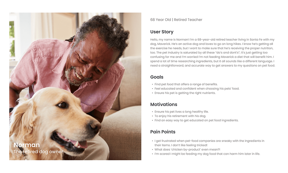
USER PERSONAS

After completing a competitive analysis, I recruited and interviewed 5 people between the ages of 21 and 65 who have experience in purchasing various dog food brands. I then created user personas based on the user research and empathy maps that helped me paint a clear and realistic picture of users' goals, needs, and behaviors.
USABILITY STUDY
My interviewees gained more confidence in choosing their pet’s food when there was clear ingredient information.
Based on my research, it became very evident that pet food is like a different language; a separate dialect. Pet food consumers are often left defenseless trying to understand a pet food label. I conducted Usability Study with 5 dog owners who feel frustrated by the ingredients in their pet’s food, and who also want to start their pets on a fresh food diet. I asked them the following questions to determine if they can complete the core tasks within the NutriBark prototype and if they can see themselves using it in the future. I then organized my data through affinity mapping.


RESEARCH QUESTIONS:
-
How long does it take for the user to complete the onboarding questionnaire about their pet?
-
How long does it take a user to feel confident editing their subscription?
-
Do users feel like they can learn more about the ingredients in their pet’s food through the app?
-
What can we learn from the user flow or the steps from onboarding to subscribing?
-
Are there parts of the user flow where users get stuck?
-
Are there more features that users would like to see included in the app?
-
Do users think the app is easy or difficult to use?
-
Would you use the NutriBark app for your pet(s)?
KPIs:
-
Time on task: How much time does a user take to complete the Pet Profile Questionnaire and confirm their subscription?
-
User error rates: How often does a user gets stuck while browsing meals or learning about ingredient info?
-
Conversion rate: How many users are subscribing?
Affinity Mapping!
After conducting a Usability Study, I was able to gather and cluster common themes with user behaviors. I categorized my observations based on app usefulness, navigation, tone, and confusion.
INSIGHTS + THEMES
Based on the trends in my affinity map, I noticed that the more educated a user felt, the more confident they were in their decision of choosing the suggested meal plan. Compared to their purchasing experience at pet store suppliers, users felt that the personalization of the app gave them the ability to be specific with their pet’s needs.

DESIGN
Although there are popular human-grade dog food vendors and subscription plans, none of them are offered through an app platform. On a daily basis, a mobile app allows users to set up their preferences from the start and customize their content. Delivery and subscription notifications are often sent through email, but with a simple smartphone app, mobile app notifications will provide a more effective alternative for communicating with users. Utilizing other features of a mobile device like a camera, contact list, and GPS not only enhances convenience, but it allows the user to interact more heavily with the brand.
TESTING + IMPROVEMENTS
Based on various feedback from 5 other peers, I continually iterated my design over the span of weeks - with 3 major improvements:


DESIGN SYSTEM
A new theme + approach to nutrition.
Green is a common color used in correlation with health and nature. With the oversaturation of green in the nutrition industry, I designated orange as the primary color of the NutriBark app. It is a color commonly associated with meanings of warmth, enthusiasm, and enjoyment - all feelings parallel to owning a furry friend!
I chose the serif typeface, Poppins, because of its clean and geometric style. It has various font weights that I used to distinguish headings and body copy. Poppins has an overall playful, modern, yet professional design style that appeals to the overall natural and nutritional themes of the app.

TRY OUT NUTRIBARK FOR YOURSELF!
CONCLUSION +
LESSONS LEARNED
What I’d do differently next time.
This was my very first UX project (Hooray)! 🎉. More than anything, being able to take my vision and develop it into a tangible design that could potentially help users was the most rewarding aspect of the entire UX process. I could not have done countless iterations without the help and feedback of those around me - and with that being said, here are a few things I’ve learned...
MAJOR LEARNINGS & POINTS I WILL APPLY TO FUTURE PROJECTS:
Be purposeful and insight-driven.
Throughout this project, I was continuously asking myself, “what is the intention of including this?“ - this kept me accountable and on track with the purpose of the app. Understanding the medium of my project (a mobile app), was crucial when deciding what was the most important information and how can I make it easily digestible and accessible to everyone. Needless to say, I now have a much better sense to obey WCAG standards next time!
Don’t lose focus on the user goal.
At times, I found myself getting wrapped up in solely the visual aspect of this project. I began to lose sight of the purpose of the app and forgot what its function is supposed to provide users. I had to iterate many times due to this, where each time I had to reel myself back into the goal of the user.
Allow iterations to signify progress - not failure.
I ended up scrapping this project 5 times before finalizing this design. I explored many options to find the solution for pet owners and found myself feeling defeated with each blank Figma file. I realized that with every “restart“, I was getting closer and closer to my final product. This was my first-ever design project using tools I have never been exposed to before - and in the end, I uncovered much perseverance and passion for solving UX problems.